Behind the Brand: Alexandra Castillo Photography
When designing for your brand, it’s important to consider what kind of message you want to send. Focusing on who you want to attract will result in a much more powerful brand than focusing only on yourself and what you like. It’s not enough for your logo to be pretty, it has to represent your brand well.
Alex came to me originally for brand coaching, during which she realized that her current visual identity did not match her core values or vision for her brand. During her rebrand, we were able to blend who she is with her goals and create a brand designed to attract people that truly value her and her work.
Brand Strategy
Up until this point Alex had been doing various types of photography, but in her heart she wanted to move away from traditional portrait photography and embrace her love for documentary photography. It was important that her brand identity reflected her desire to create raw and authentic images that capture life as it happens.
In particular, Alex has a heart for documenting families and celebrating all the little details that make up daily life. During the homework process, I think Alex may have had one of my favorite answers ever when she wrote, “I want to help people remember the steps through life and not just the finish lines because life is more about the walks we take than the races we enter.” Talk about dreamy, right??
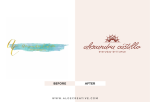
During this process, Alex realized that her current logo (which she loved) was much too formal and clashed with the type of work she wanted to do.
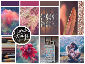
As a final step in my brand coaching process, I always present the client with a mood board to visualize the goals we discussed. Seeing her logo next to our new mood board really clinched the need for a redesign in her mind.
Logo Design
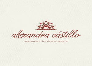
The first step in the redesign was to represent her new direction in a logo. During the brand coaching stage, Alex came up with an awesome new tagline “Everyday brilliance.” I used this as a jumping point for the logo concept.
The sun perfectly represents both “everyday” and “brilliance.” However, the sun can also be an overused symbol, so I knew I wanted to take a fresh approach. Alex originally fell in love with documentary photography during her time living in South Asia, so a henna inspired design paid tribute to that, and the hand drawn nature of henna complements the raw authenticity of Alex’s images as well.
 I create lots and lots (and lots and lots..) of versions and iterations when working on a new logo, but I always narrow down to one original concept to present to my clients. I would rather use all of my attention and energy to focus down to the absolute best solution, rather than diluting my attention and time among multiple concepts. I then took Alex’s feedback and together we refined until we came up with a logo to serve as a cornerstone for her new visual identity.
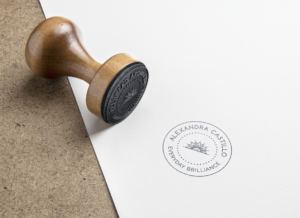
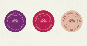
 I also designed a submark that Alex can use as a watermark for her photos, have made into a stamp, or whenever her primary logo isn’t a good fit.
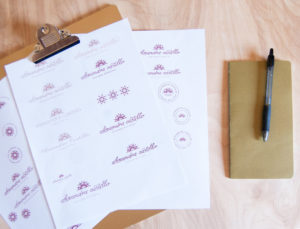
 Once the new logo is established, I always have fun building it out with other elements. Alex can use these in different materials she creates for clients, or as stickers, for example.
Build Out
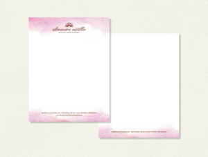
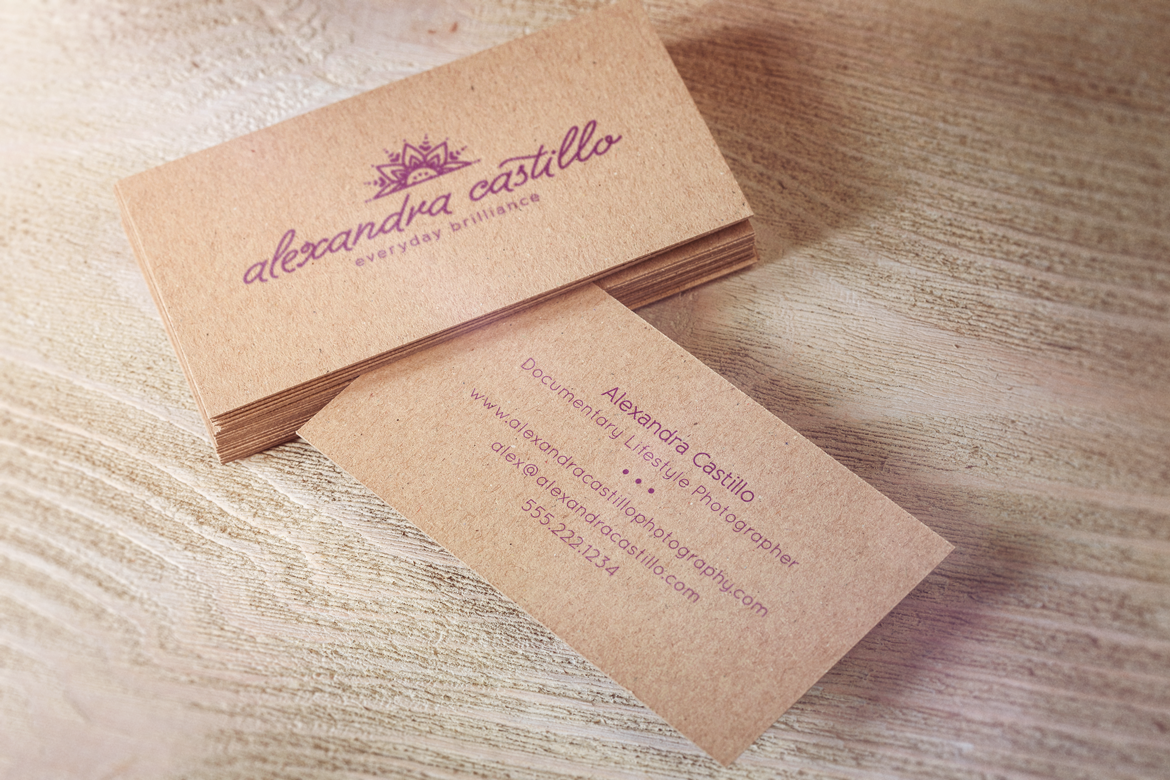
With the logo system taken care of, I built out Alex’s visual identity and designed letterhead and business cards for her to use.

Does your brand identity reflect your core values?
As you can see, I incorporated lots of natural (such as the uncoated brown paper used in the business cards) and hand drawn elements to reflect Alex’s mission: to capture and celebrate the real, messy, and beautiful nature of everyday life.
What about you? Do all the elements of your own brand design reflect the story you want to tell? I’d love to help! You can sign up for a free brand audit from me here. Just let me know you’re interested in your free brand audit!
6/09/16
© 2015-2020 BRAND EPIPHANY ALL RIGHTS RESERVED • privacy policy
brand epiphany is a brand strategy and design studio • powered by sunshine and ♥ since 2015
 Sources:
share: