Behind the Brand: Cakes of Whimsy
If you want visuals for your business that truly represent who you are and who you want to work with, it’s important to build a strong foundation first by asking yourself “why.” Why is your work important to you? Why is it important to the people you want to help? Ashley was willing to dig into these questions, and the result is a not only a genuine and timeless visual identity, but a deeper knowledge of her own strengths and the desires of her dream clients.
Ashley Meis is a cake artist who create just about anything out of cake. She had been making cakes for years and honing her craft, and was ready to take things to the next level by putting herself out there professionally and starting her own business.
Brand Strategy
Since we were creating Ashley’s brand from scratch, it was important to build a strong foundation and determine the heart, the “why” behind her business. After a few coaching sessions and working through the Brand Epiphany Brand Clarity Process, Ashley was able to determine that the reason that she loves creating cakes is the ability it gives her to celebrate every person’s unique personality and truly make them feel special by bringing their dreams to reality.
Her heart is in creating custom, often elaborate, “out of the box” cakes. We knew we wanted to emphasize those two things in her brand: 1) her ability to create unique custom cakes and 2) her desire to make people feel truly special at their celebrations.
With this foundation in place, we moved on to choosing a name and tagline. After much brainstorming and mind mapping, we landed on the name “Cakes of Whimsy,” and the tagline “Baking up imagination.” This immediately communicates the types of cakes that Ashley likes to bake and the type of experience you can expect from working with her.
Visual Strategy
The next step was to establish a visual direction for her brand. I had Ashley pin items to a secret Pinterest board that she felt represented her ideal client. I always have clients focus on the audience they would like to attract, which provides a lot more intentionality than merely pinning things they “like” or that appeal to them but wouldn’t necessarily send the right message for their brand.
With Ashley’s input and the knowledge I had of her dream client from our coaching sessions, I created a moodboard to represent the direction that we wanted to take her brand visually.
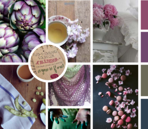
As you can see, Ashley’s brand has a bit of a shabby chic aesthetic, which makes sense for her target audience living in the rural East Mountain area of New Mexico.
Logo Design
Before I even begin sketching, I always begin logo design by mind mapping as many ideas as possible so that the ideas are flowing when I sit down and put pencil to paper. I knew from my research that many cake shops incorporate a cake or cupcake into the logo, and I wanted to avoid that cliché. I also knew that I wanted her logo to communicate the types of cakes she bakes: completely custom imaginative cakes.
With that in mind I decided to pursue the idea of focusing on the act of baking the cake, rather than the final product. I experimented with some ideas using a mixing bowl and spoon, and finally decided to narrow down to just the spoon. In my mind I wanted to illustrate the tagline “Baking up Imagination.”
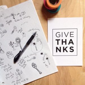
Here are some sketches of my initial ideas. As you can see, my sketches are often quick and dirty. My intent is more to get my ideas down, and all revision takes place once I move to the computer.
After moving to the computer, I narrowed down to the following two concepts.

I liked both, but the second option is stronger due to its simplicity and how seamlessly it incorporates the tagline. It also works better at a variety of different sizes, which is always an important thing to consider when it comes to your logo.
I cleaned up the second option even more and refined the proportions to reach the final result.
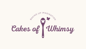
The butterfly coming out of the spoon represents the act of bringing imagination to life, the main typeface has the handmade quality of type we agreed upon in the mood board, and the overall effect is clean and simple while still being memorable.
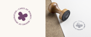
I also designed a submark that works well for smaller uses, such as social media profiles and a stamp she can use on her cake boxes.
Brand Build Out
With the logo finalized, I moved on to designing the collateral for her business.
Business card
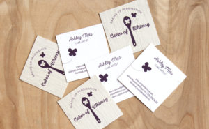 I carried the wood grain from the mood board into the business card design. We decided on a square shape (printed by MOO, who I highly recommend) to perfectly frame her new logo.
Photography
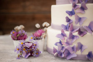 Professional photography is important to showcase products, especially food, so we organized a photo shoot with Aaron Meis to photograph some cakes for Ashley’s portfolio and create images that we could use in the rest of the materials for her brand.
For her main brand photos, Ashley designed a wedding cake that included her new signature purple butterfly to highlight in the photo shoot. We relied on the art direction established in her mood board and incorporated lots of flowers and some rustic elements.
Here’s what Ashley had to say about the process.
“Before hiring Amanda I was not very confident in my brand and a little apprehensive about the branding process. But going through everything made me think about why I was starting my business in the first place and how I needed it to look for the people I wanted to attract. It made me feel like I was going to end up with a really good foundation that was true to me.”
Interested in developing a solid foundation and visual identity for your own brand? Read more here.
4/14/16
© 2015-2020 BRAND EPIPHANY ALL RIGHTS RESERVED • privacy policy
brand epiphany is a brand strategy and design studio • powered by sunshine and ♥ since 2015
share: