How to Choose the Right Photography for Your Brand
One of the most important visual elements of your brand is your photography. So much so, that many influential brands can be identified by their photography alone. Calvin Klein immediately comes to mind. This is one more instance where consistency will build trust. Photography is one of the best ways to infuse emotion into your brand and plays a strong role in how people will perceive your brand’s personality.
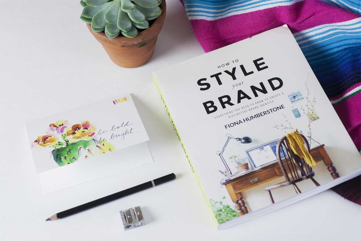
Although I’ve always been pretty good at choosing photography that fits well together and evokes the mood I’m going for, things really clicked for me when I read Fiona Humberstone’s book How to Style Your Brand. After reading her book, I realized that photography can be categorized into four main seasons, each with their own distinct personalities and associations. By choosing a specific season for your brand, you can create a harmonious visual identity that enhances and strengthens your brand’s core values.
As a small business owner or solopreneaur, you should take your own personality into consideration. If you’re a super casual person who loves wearing cut-offs and flip-flops everyday, then choosing an opulent formal winter personality for your business is probably not a good idea. Lean into your own natural characteristics and choose a photography style that enhances and magnifies your strengths. Remember, you are the secret ingredient to a successful brand!
Spring

Spring photography is light, bright, and full of color. Think of the hues in flower gardens as they spring up and bloom. Spring colors are associated with energy, fun, and creativity. On the flip side, spring colors can also be perceived as juvenile or unreliable. Children’s companies and creative industries can use spring photography quite effectively.
Summer

Summer photography is muted with blue undertones. Delicate colors such as lavender, baby blue and powder pink. Summer is associated with romance, grace, and responsibility. Summer colors can also come across as reserved or aloof. Summer photography is often used in the wedding industry due to its romantic and graceful nature.
Fall
 Autumn photography is rich, earthy, and golden, like the changing leaves in the trees. Typical colors might include burnt orange, brown, and teal. Autumn colors are typically associated with warmth, security, tradition, and passion. Negative associations might include resistance to change. Autumn photography can work really well for free-trade or handmade goods businesses (that’s why so many IG companies use them!)
Winter

Winter photography is clear, strong, and intense. Ice blue, hollyberry red, royal blue, and metallic colors. Winter is the only color palette to contain black. Winter photography can portray opulence and luxury; However, winter photography can also come across as unfussy and grounded. Possible negative connotations may be coming across as cold and uncaring. Winter photography works well for high-end luxury brands, or no-nonsense businesses such as law or technology.
Which photography style works best for your brand? My brand is a spring personality, so I try to use bright colorful photography as much as possible.
For more information on color theory and how you can apply it to your brand, I highly recommend getting Fiona Humberstone’s book The Brand Stylist for yourself. You can also find her online at www.thebrand-stylist.com.

3/29/16
© 2015-2020 BRAND EPIPHANY ALL RIGHTS RESERVED • privacy policy
brand epiphany is a brand strategy and design studio • powered by sunshine and ♥ since 2015
share: